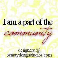
This is a combination that I find myself using most of the time. Personally, that is because I really like cursive fonts and all caps. =) Here are a few design examples.

Another combination is a unique & quirky font with a simple font.
This combination is more common, I think, because everyone wants a unique font. One that is different from anybody else's.
Wondering where to find fonts?
I've downloaded fonts from the following sites: dafont, fontsy, and Kevin & Amanda. These are all free font sites. (I would be careful with downloading from any site you're not familiar with. These three sites I haven't had any issue with, but still be careful. You don't want a virus or anything!)
There are so many fonts, how to decide which one to use?
I don't believe this is a life or death decision, I wouldn't spend hours contemplating it. =P The most important thing is that your design reflects you. The fonts you choose are a part of the design, and therefore should reflect you. For example I came across a font that is really similar to my signature, so I use it for my blog post signature.
Kevin & Amanda also has a wonderful tutorial on how to use a cute font for your blogger post titles. The only thing I did differently when following her tutorial is my hosting site. I use Bravenet as my hosting site instead of Webs because it is sooo much faster.


1 comment:
Great advice, Emily! I loved reading this post - you're so right about mixing fonts up and keeping everything different.
My favorite font would probably have to be OptimusPrinceps (the font used in the "creative. beautiful. unique." section in the header. Haha but it changes all the time! =D
Yeah, I love Dafont too. I use that site pretty much exclusively.
I just re-discovered Times New Roman, so I've been doing a bunch of combinations using that font with some other ones.
Post a Comment