Friday, December 30, 2011

The Beauty in Design Challenge//Week 5

*Congrats to Hannah for winning last week's challenge!*


Christmas is past. So sad. :( But I made our family a little photo card with a family picture and all our names, with a little "Merry Christmas and a Happy New Year" wish on it. So I figured that would be a nice challenge!

So.
The Rules:
1. Must be a 4x8. Or, 960x1920px.
2. Must include a family photo. Make sure not to include your last name! I changed mine a bit, so our last name is Jones for this challenge! ;)
...and I think that's it! I really can't wait to see yours! ;)


1. To enter, create your photo card and write a blog post about the challenge and your entry, and post your design in your post. Make sure to include a link back here or the button. Then submit the link to your post in the linkup below.
2. Have fun and be creative!


Thursday, December 22, 2011

The Beauty in Design Challenge//Week 4

*Congratulations to Marcia for winning last week’s challenge!*
Christmas will be here in three days, and in honor of it, I thought we could do something Christmas-y this week. ;) This week’s challenge is to create a Christmas desktop wallpaper.
The one rule: your wallpaper must be 1600 X 900 pixels.
Feel free to use any photos/quotes/song lyrics/etc. that are Christmas-y is any way!
  1. To enter, create your walllpaper and write a blog post about the challenge and your entry, and post your design in your post. Make sure to include a link back here or the button. Then submit the link to your post in the linkup below.
  2. Have fun and be creative!
Go for it! Can’t wait to see what you all come up with. ;)


Simple Editing Techniques for Photography

Hey guys! For my first "real" post, I'm going to show you some simple, easy ways to edit photos to make them more beautiful and professional looking. My camera is a Canon Powershot A560, so it's a point and shoot camera. It has just the amount of settings I need, but it automatically adjusts things like the aperture setting, so I don't always get exactly the look I'm wanting for my photo. So, to the GIMP!
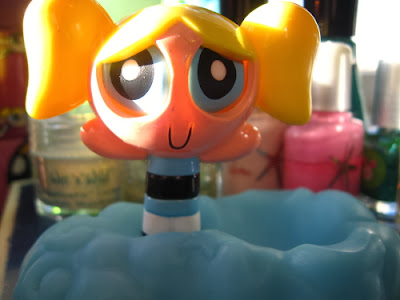


This is the photo I'll be working on. See? It's not too shabby of a photo, but it could use a little boost to the color as well as the sharpness of the image. Also, the background could use a little more blurring. Let's get started!

The first thing I'm going to do is work on the color. The fastest way I found to do this on photos (where you may be editing a bunch in bulk) is to use the Brightness/Contrast tool. The brightness and contrast of photos have been edited since the beginning of photography!
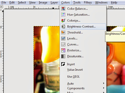


After you have the tool open, adjust the brightness level to +30, and then adjust the contrast level to +30. According to your photo, these levels will differ.


And the above is what it will look like after you brighten and contrast it! Another way to do get similar results is to use the screen/soft light technique on the layers. In that, you just duplicate the main layer once and set it on screen. Then you duplicate the main layer again and set it to soft light.
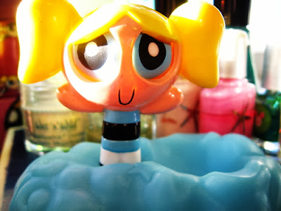


And the above is the result! Not much difference, but the brigtness/contrast tool can be use faster. Ok, now for the sharpening of the image.
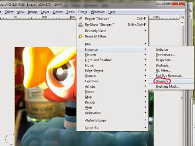


After you open the "sharpen" box, adjust the sharpness to 30. I generally use 30 as a rule of thumb for all my photos but, again, it's according to the photo. Just remember not to sharpen your photos too much, or they'll get really grainy looking. On to blurring!
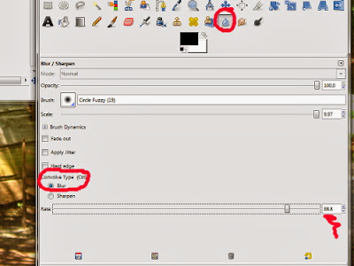


Select the blur tool on your GIMP toolbox, then in "convolve type" select blur. I like to use a fuzzy brush for my blurring tool, but really whatever brush your comfortable with will work. One key to blurring the background of an image is to NOT blur any of the lines of your main focal point. In this photo, I want Bubbles and the cloud she is staying on to stay front and center. So I need to be careful when blurring the background not to blur the edges of her.
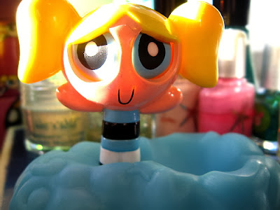


And that's what it will look like when you're done! If you want to add some bokeh textures, now would be a good time (I'll show you how I do this in another tutorial). I use these techniques generally in all my photos.
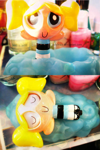


Above is the finished Bubbles project! I edited the brightness of this one a lot more, so this is why it looks different than the example. If you have any questions, or you would like to request a tutorial, please comment below and I'll get back to you. :)

Wednesday, December 21, 2011

Hi guys - first post!

How old are you, and how many siblings do you have?
I'm 17 and I have one older sister. :)

What are your interests?
I love photography, reading, music, psychology and theology. I also am highly interested in charitable work but, as of yet, God hasn't given me any ways to help yet - He's working on it! :)

Favorite hobbies?
I like photography mostly, and I edit many of my photos in GIMP. I also like to read about interesting subjects, so I guess you could say learning is a hobby for me as well.

Favorite subject in school?
I always liked science, but also literature!

When did you become interested in graphic design?
Gosh...when I was like 12 or 13 probably.

Biggest goal for this year?
For 2012, I would like to focus more on others and less on my self. I'd like to find a way, possibly through selling my photography, to make money give back to the world.

What are you looking forward to the most in being a part of this community?
Writing tutorials. :D

What's your favorite program to use when designing?
GIMP.

The big question - Mac or PC?
(hint - if you answer "mac" you might be out of favor with me. ;) Naw, just kidding.)
I use a PC. :)

Do you have a personal blog we can connect with you on?
Yup! It's called Eternal Simplicity and you can visit it by clicking here.

Also, please email me if you'd like to get in touch: aidylvice13@yahoo.com
I'd love to hear from you, and I can't wait to get involved! :D

Thursday, December 15, 2011

Beauty in Design challenge - Week 3

*Congratulations to Grace Anna for winning last week's challenge!!*

Hey, y'all! Grace Anna here for week 3!

This week's challenge is to make a picture/graphic/whatever-you-want-to-call-it with your favorite Bible verse or quote.

Here is one I made just to give you an idea of what I mean...


The only requirement is to make the size 800 px wide and 500 px tall.

  1. To enter, create your design for your favorite bible verse or quote and write a blog post about the challenge and your entry, and post your design in your post. Make sure to include a link back here or the button. Then submit the link to your post in the linkup below. 
  2. Have fun and be creative!


So, lets get started! I can't wait to see what y'all come up with!


Tuesday, December 13, 2011

meet marcia


how old are you, and how many siblings do you have?
I'm 13 going on 14 in February..and I have 2 younger siblings

what are your interests?
well, first and formost, I love Jesus with all my heart and the goal of my life is to honor Him! I love photography, seriously it is my passion. And my dream is to become a professional. Also graphic design, I am very new to HTML and all that, but I have created business cards, and small brochures for my parents business. 
favorite hobbies?
I love reading, especially the Anne of Green Gables series, I have read them countless times. And I love journaling, and blogging. And I love school...(weird, I know but I love it! maybe it has something to do with being home schooled.)

favorite subject in school?
 
I love History in school, it is amazing

when did you become interested in graphic design?

Well, it was about 3 years ago, (I think) I started using Microsoft Publisher, then I found a "real" program my dad had. Now, I am taking a class learning in gimp. ;)

biggest goal for this year?

This year or the next? ;) I want to get better in my photography, and graphic design as well as save up for a "big" camera. :)

what are you looking forward to the most in being a part of this community?

I am looking forward to learning HTML codes and all that. ;)

what's your favorite program to use when designing?
Well, I have been using Print Shop and I am most comfortable with that, but I'm learning gimp, so I want to practice in that a lot.


the big question - mac or pc?
PC all the way, I've never used mac.

do you have a personal blog we can connect with you on?

Yep, Enchanted Musings

Saturday, December 10, 2011

ashlyn is joining too. :)


How old are you, and how many siblings do you have?

I'm Ashlyn, fourteen. I have six siblings, (There's me, I'm the oldest. Olivia is ten, Elizabeth is eight, Sarah is six, Daniel is five, Julia is three, and Anna is 10 weeks old. That's right, four under six.)  plus me, plus my parents, which equals nine. Nine equals chaos, hectic Sunday mornings, large tables, messy rooms, fixing meals in large quantity, and making homemade laundry soap. Three loads of laundry a day is normal, and there is a massive amount of dishes. Oh, and you should see how fast cereal goes in our family. It's unreal.

what are your interests?
I have a lot. :)
 web design- the first thing I ever did was a blog button,  and the next thing was adjusting widths manually. In Minima, on a test blog. You know what? I was so scared of messing something up that my hands were shaking as I typed in different pixels. I had no clue why outer wrapper had to be just a little bit bigger (or perfect) than the main wrapper and sidebar wrapper. I progressed slowly, and I had the help of a wonderful bloggy friend, Mary Ann. She guided me through borders, margins, paddings, false/true widgets, and about everything else. Except- I used Hannah's post on the Accordion. ;)
graphic design- photoshop elements is awesome,  and I'm learning, slowly. It's fun. :)
politics- Reagan conservative here. :) I'd like to be a journalist when I "grow up."  :)


favorite hobbies?
piano playing, watching old movies and shows, (eg, the Andy Griffith Show) photography, and drinking coffee. :)

When did you become interested in graphic design?
mmmm. I think it was in early July. :)

biggest goal for this year?
mwhahaha, since this year is just about over...(how can that be...???) I guess 2012's would be to finish Algrebra, start teaching piano lessons and perhaps doing some small portrait sessions.

What are you looking forward to the most in being a part of the community?
I really like the idea of posting for help. I also would love to post links to test blogs for critiques, because that is what I love getting. I love to know what other people think. Because, seriously, I go through serious spurts.
I find  a certain font, and I use it for everything. everything. Or I'll find a CSS technique and I'll go overboard. I remember when I found the technique for using a background when hovering just over post titles (do you know what I mean?) and I used it for everything.
The next thing I liked was when the page went bloppity blop when you hovered over links. (because the font was larger, used letter spacing, boldness, etc). I went nuts. The whole page looked as if it was spazzing out.
...thus, I definitely need constructive criticism.

What's your favorite program to use when designing?
I currently use Adobe Photoshop Elements. and love it.


The big question- mac or pc?
PC! I've used windows all my life, and probably will continue to do so.
(I want to add that I'd love to try an apple someday, but I don't want Hannah mad at me.)


Do you have a personal blog we can connect with you on?
of course. :D 'tis here. I have also just started a blog that I'll post my portfolio and challenges on, and it's here. I offer free blog designs here, and in January, will be offering a course on basic blog design. But the URL is not available now cuz it's not ready yet.  :)


Friday, December 9, 2011

Concerning Padding... and Comments

I've been trying to figure this out for a while, but being unable to, I just thought I'd go ahead and ask you guys. Does anyone know how to adjust the padding for comment authors' profile images and also for the comment form?
When I design blogs with backgrounds I usually colorize the main and sidebar wrappers, because most often I have a png see-through banner which I want to have the actual blog background as its background (hope you're still following me...). Anyway, as you most likely know, post body padding as well all those other things in the main wrapper must be adjusted after you remove the outer wrapper, unless you want everything stuck to one side. I've been able to adjust everything except the comment form and comment profile pictures. Does anyone know how it's done?

~~~~~~~~~~~~~~~~~~~~~~~~~~~~~~

How is it that I puzzle over this for over a month and figure it out just as I'm posting for help? I can't believe I never thought of the little thing that would've saved me tons of time. To anyone else seeking an answer to the question above, all you have to do is adjust the main wrapper padding. It's that easy!
You wouldn't believe all the codes I've tried to make it work, while all this time, all I had to do was simply adjust padding! :P

Hope this helped you... or at least made you laugh! :D


Meet Grace Anna

Hello! I'm Grace Anna. I was so excited when I saw the Design Challenge and I am thrilled to be a part of it! Here is a little about me...

How old are you, and how many siblings do you have?
I am 17 and I have two little sisters who aren't so little anymore.

What are your interests?
In the last year, I have fallen in love with women's ministry. I also like pretty much anything computer. :)

Favorite hobbies?
Knitting and crocheting, reading, and organizing.

Favorite subject in school?
History. It is so amazing to see God's hand in everything that has happened!

When did you become interested in graphic design?
Just in the last few months. I was trying to figure out how to make a button for my blog, and I discovered the world of HTML.

Biggest goal for this year?
Since I just turned 17, I made a list of things I want to do over the next year. I think the toughest is to read through the Bible.


What are you looking forward to the most in being a part of this community?
Having a place to go when I get all befuddled! :)


What's your favorite program to use when designing?
Sadly, the thing I use the most is Paint. I can't afford Photoshop, and Gimp just confuses me! But, I'm working on learning to use it. {Gimp tutorials, anyone?}


The big question - Mac or PC?
(hint - if you answer "mac" you might be out of favor with me. ;) Naw, just kidding.)
Sorry, Hannah! I love my Dell. But, I have gotten to play a little bit with a Mac, and think I would like it if I had time to learn to use it.


Do you have a personal blog we can connect with you on?
I would love to have you visit!  graceablog.blogspot.com
And feel free to email me! I'd love to hear from you! graceablog@gmail.com

Add Music to Your Blog

Lots of people (I used to be one of them) have wanted to put music on your blog, but don't know how. I just found out last week, so I thought I'd share!

First, go to this website. Sign up, and click "Create a Playlist" at the top of the page. Name your playlist. Click "Create Playlist." Then there should be a Green box that says, "Playlist successfully created. Use the search box above to start searching for music to add to this playlist." Above that, there is a search box. Find your favorite songs. (When you see a song you like, click the + button that is right below the play button)

Once you have created your playlist with all your songs, click on the tab on the top of the screen that says "Share My Playlist." Click this blue button next to the playlist that says "All other sites." Then, you can change the color of your playlist, and there are also some other settings. Once you are done with this, click the blue button that says, "Get Code."

Now you can either:
{1} Find the button that says "Blogger." Click that, put in your username and password, and it will upload to your sidebar. Or
{2} Copy the code at the bottom of the white box, go to Blogger.com/home, click Design, and add it to your blog from there.

Hope that helps! There is a lot of info there, if this is confusing, let me know!

{this was posted from www.gracy-girl.blogspot.com}

Thursday, December 8, 2011

The Beauty in Design Challenge // Week 2

(fyi: Eve was unable to post this week, so I was asked to)
The winner from last week's challenge was Emily Grace, congratulations!

To start off, here are a few general rules about the challenge.
  1. Anyone can participate – no matter how old they are or if they are already a designer or not.
  2. Designs may be submitted during the first three days of the week, and voting will be held during the next four days. So check back!
  3. The schedule is up in the sidebar for who will be choosing the challenge each week. Again, there are no obligations to do this, so don’t feel pressured! =)
This week’s challenge is to design a recipe card for Georgia Pecan Cake! Feel free to use your imagination and creativity to come up with a great design that is easy to read – there are only a few requirements.
  1. You will be submitting one design of a recipe card for Georgia Pecan Cake in a .jpg or .png file and the size must be 4x6 in
  2. Your design must include the recipe below: 
  3. Georgia Pecan Cake
    1 c. butter, softened 
    2 c. sugar 
    4 eggs 
    1 t. vanilla extract 
    ½ t. lemon extract 
    3 c. flour 
    ¾ t. salt 
    ½ t. b.powder 
    ½ t. b.soda 
    1 c. buttermilk 
    1 c. chopped pecans 
     1.) In a large mixing bowl, cream butter and sugar until light and fluffy. Add the eggs, one at a time, beating well after each addition. Beat in extracts. 
     2.) Combine the flour, salt, baking powder and baking soda; set ¼ c. aside. Add the remaining flour mixture to the creamed mixture alternately with buttermilk. Toss pecans with the reserved flour mixture; fold into batter. 
     3.) Pour into a greased and floured 10-in tube pan. Bake at 325* for 60-70 min or until a toothpick inserted near the center comes out clean. 
     4.) Cool for 10min before removing from pan to a wire rack to cool completely.
  4. (optional) You may include this photo of the recipe in your design if you wish. Or your own photo if you take one of the cake using this recipe.  (feel free to manipulate the photo however you wish - for this project only)
  1. To enter, create your design for the recipe card and write a blog post about the challenge and your entry, and post your design for the recipe card in your post. Make sure to include a link back here or the button. Then submit the link to your post in the linkup below. 
  2. Have fun and be creative!
Feel free to ask any and all questions that you might have – and go link up! We’re looking forward to seeing all the entries. 


Wednesday, December 7, 2011

Buttons?

I know, posting twice in one day, not so cool. (But hey! i do that over at my blog all the time!)

I have made about five buttons for my blog...but I can't figure out how to make a code for it. Can anyone help with that???

Thanks!

Meet Grace

How old are you, and how many siblings do you have?
I am 12 and the oldest of three kids. My sibs are Faith and Jarrett. {you should totally click the links}


What are your interests?
Photography. School. Dogs.


Favorite hobbies?
I love photography, blogging, and dancing. SO FUN!


Favorite subject in school?
History. Totally History.


When did you become interested in graphic design?
Umm...about two weeks ago. No, I'm not kidding. I'm hoping I'll learn more from being a part of Beauty In Design ;)


Biggest goal for this year?
Right now, pass the term test ;)


What are you looking forward to the most in being a part of this community?
Learning much more about designing! I don't know much (yet)...


What's your favorite program to use when designing?
Picasa 3.9


The big question - Mac or PC?
PC!!!

Do you have a personal blog we can connect with you on?
Of course! {click here to see it}

My email: gracygirlblog@gmail.com

Monday, December 5, 2011

Voting Begins!

All of our submissions for the first week of the Beauty in Design Challenge have been received, and now it’s time to pick a winner! Vote for your favorite design using the poll that's in the sidebar.

I will be sending out an email to everyone who has volunteered to pick the weekly challenge within the next twenty-four hours, so be looking out for that!

Thanks to everyone who entered the first challenge - and good luck!

Thursday, December 1, 2011

The Beauty in Design Challenge//Week 1

Today we’re kicking off the first day of the Beauty in Design Challenge! In case you haven’t heard about what we’re doing here, check out this post for an explanation.

To start off, here are a few general rules about the challenge.

  1. Anyone can participate – no matter how old they are or if they are already a designer or not.
  2. Anyone may opt out of choosing the weekly challenge. Choosing a challenge is not a requirement for participation.
  3. Designs may be submitted during the first three days of the week, and voting will be held during the next four days. So check back!
  4. The schedule is up in the sidebar for who will be choosing the challenge each week – I will be sending out emails to all of you with further instructions. Again, there are no obligations to do this, so don’t feel pressured! =)

This week’s challenge is to create a logo or identity for the challenge itself! Feel free to use your imagination and creativity to come up with a great logo – there are only a few requirements.

  1. You will be submitting two banners with the logo on it – one must be 850 X 150 pixels (horizontal), and the other must be 200 X 200 pixels. (This is for the purpose of having both a sidebar button and a post banner.)
  2. Be sure that the colors you choose don’t clash with the colors of this blog (It might look a little funny if they did! =D )
  3. The title of this challenge (The Beauty in Design Challenge) must be included on both banners, and the subtitle (a weekly design challenge at the beauty design studios community) must be on at least the large banner.
  4. To enter, create the two banners and write a blog post about the challenge and your entry, and post both banners in your post. Then submit the link to your post in the linkup below.
  5. Have fun and be creative!

Feel free to ask any and all questions that you might have – and go link up! We’re looking forward to seeing all the entries.